The pattern
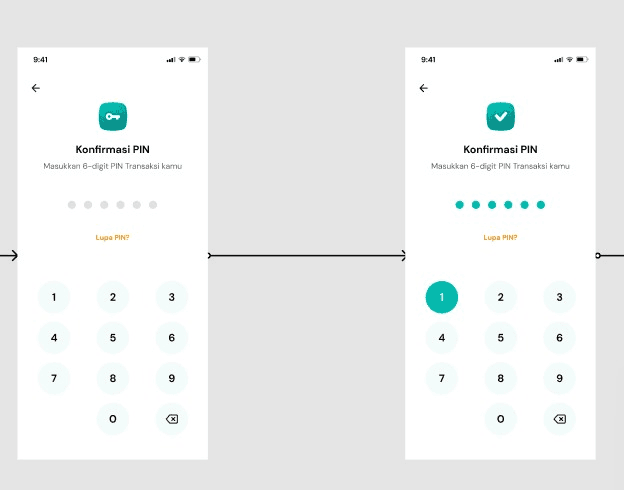
BSI's number pad used the app's standard tap-feedback: press a digit, it fills solid teal; release, it goes back to white. Consistent with every other button in the app, which is exactly why nobody had questioned it on this screen.
BSI · PIN Confirmation Security
Every digit on BSI's PIN confirmation screen lit up teal the moment it was pressed: standard tap-feedback, used everywhere in the app. On this one screen, it also meant the PIN was readable off the colors alone. I proposed removing it entirely.
I joined BSI right after its three-bank merger, taking over a component library that had drifted out of sync with the new brand. Most of the work was systems-level: rebuilding shared components, running usability tests on core banking flows. This case study is about one screen that came out of that work: PIN Confirmation, the last step of every transaction in the app.
BSI's number pad used the app's standard tap-feedback: press a digit, it fills solid teal; release, it goes back to white. Consistent with every other button in the app, which is exactly why nobody had questioned it on this screen.
On a PIN confirmation screen, that color change maps one-to-one to the digit being entered. Anyone glancing at the phone, over a shoulder or on a photo taken after the fact, could read the PIN off the flashing buttons without ever reading a number.
Noticed it during routine design QA on the confirmation flow: the same tap-feedback used app-wide, applied without a second thought to a screen where it wasn't just cosmetic.
Ran A/B testing on the PIN screen with internal BSI users before proposing anything. The shoulder-surfing worry came up unprompted, in their own words: public places, PIN entry, someone standing close.
Took the test results to my lead along with a proposal: strip color feedback off the number pad entirely, and move all visible state to the dot row above it.
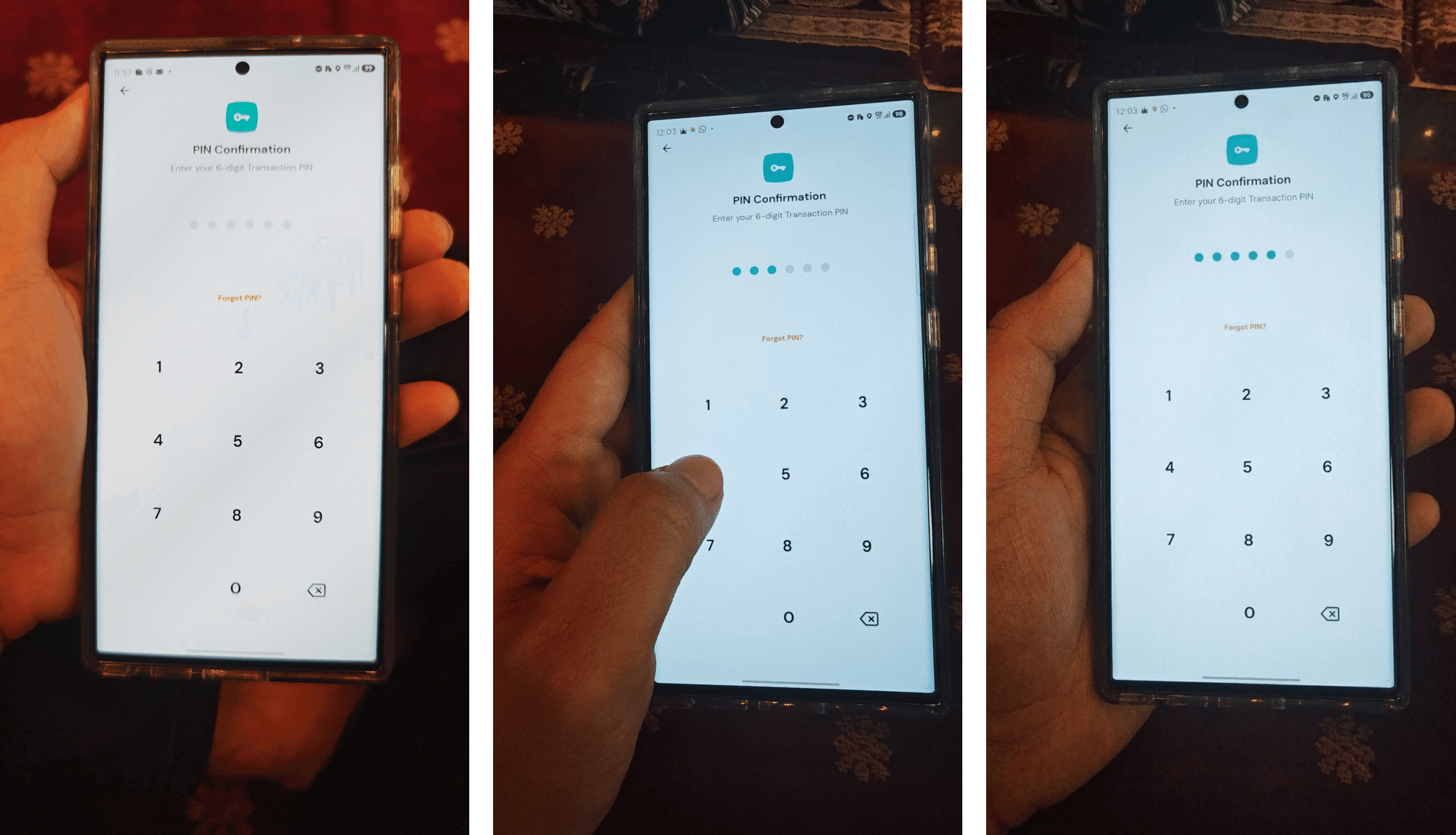
The number pad now stays completely neutral, pressed or not: no fill, no color, nothing that changes with which digit was tapped. All the feedback moved to the six dots above it: they fill in one at a time as the PIN is entered, and that's the only thing on screen that changes state.
I don't have a dashboard number for this one. It's not the kind of fix that moves a chart. What it did was close a side-channel that had no reason to exist on a transaction PIN screen, using feedback from the same users it was protecting.
Reflection
The most dangerous feedback is the kind that feels right. That teal flash matched every other button in the app, which is exactly why nobody had questioned it. Security work isn't always about adding a warning; sometimes it's noticing which pattern doesn't belong on this one screen.