As a designer moving between companies
Every new design system meant relearning someone else's conventions, disciplined or not. I had no portable foundation of my own to start from.
Design System · Personal Project
Every bank I worked with had its own design system, and every time, I started from zero. Natuna Digilab fixes that: a foundation that doesn't belong to any one brand, so it moves with me, only the tokens changing underneath.
Right after leaving BSI in 2023, I looked back at every team I'd worked with and found the same weak point: the design system. Not the visual polish: the discipline behind it, the thing meant to hold a product together, kept breaking down in practice. So I built Natuna Digilab as my own initiative: a foundation I could trust instead of rebuilding one from scratch every time.
Every new design system meant relearning someone else's conventions, disciplined or not. I had no portable foundation of my own to start from.
Developers kept asking the same specific questions: “why is this hex different here,” “why does this stroke width change for no reason.” The things supposed to be consistent by definition, weren't.
Most design systems on Figma Community are heavily branded (colors, logos, identity baked in), so people have to “un-brand” them before they're useful as a starting point.
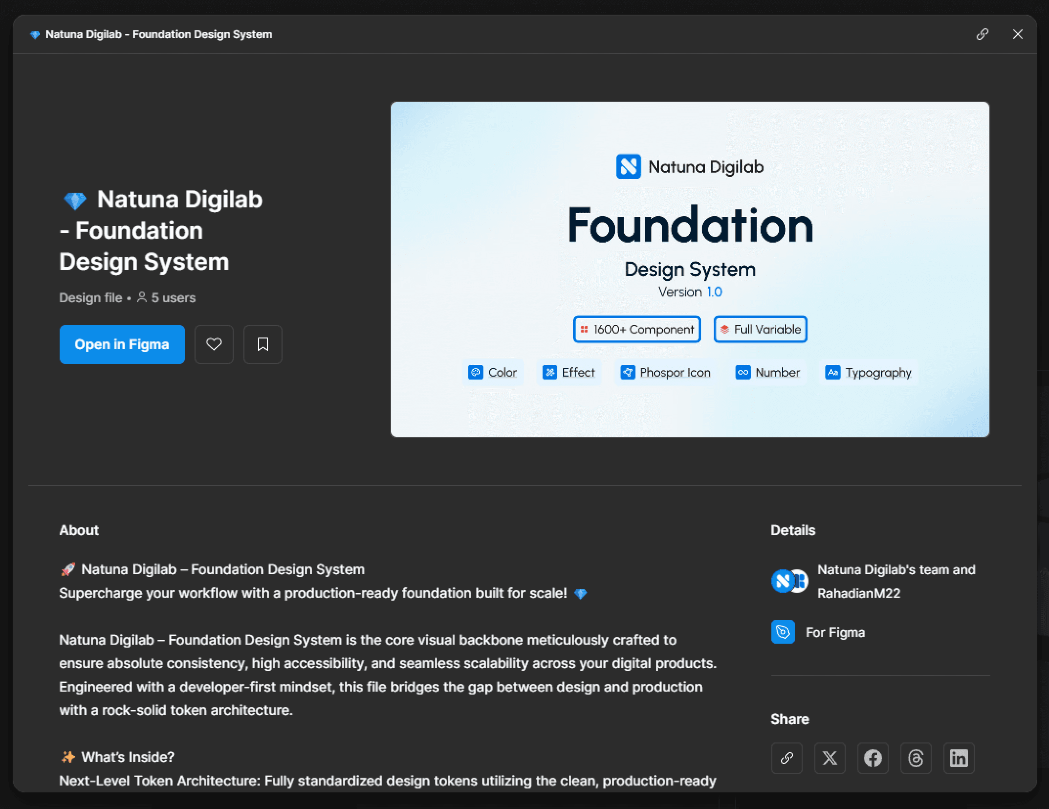
Built from five token categories before any component existed: Color (--color-*), Typography (--text-*), Effect (--shadow-*), Number (--spacing-*), and Icons (on Phosphor as a neutral base). Rebrand the foundation, and only the token values change, not every component.
A deliberate choice, not a limitation. Neutral on purpose, so it works as a starting point for anyone instead of one brand identity. Most public design systems do the opposite: double as a showcase for their creator's brand.
Both prove the foundation isn't just built to look good in Figma: there's real attention to how a developer consumes it at handoff.
The earliest version was trial and error. There was a pull to copy proven systems (Wise, Gojek's Asphalt/Aloha), but Natuna stayed anchored to its own principle: unbranded, ours. Every component went through repeated iteration before being called “done.”
Natuna Digilab is at v1.0 and still building. 1,600+ components, full variable support across five token categories, distributed on Figma Community so others can use it too.
Full property set: Shape, Type, State, Size (sm to 2xl), swappable icons, editable label. Dozens of variant combinations, all from one component definition instead of duplicated one-offs.
Type, optional attached button, toggleable label, description, helper and character count, nested instances instead of flattened layers. Only this configurable because every state pulls from the same tokens.
Ideas from Natuna Digilab shaped BRISPOT's token architecture, and patterns that proved out there folded back into Natuna Digilab. No big external number yet, but it speeds up how I work on every new project.
Reflection
If the other case studies show the result of a solid design system, Natuna Digilab shows how I build that foundation in the first place. From zero, not just inheriting whatever a company hands me.