Back to Case Studies// BRI · Internal Lending Platform

BRISPOT — Internal Lending Platform.

A Briguna loan applicant waited around three weeks for an answer — and the credit decision itself wasn't the slow part. The request kept getting handed off between people who each had to rediscover the context first. I redesigned BRISPOT's approval workflow to close that gap.

RoleSenior Product Designer
CompanyBank Rakyat Indonesia
PlatformBRISPOT
TimelineDec 2025 – early 2026
// Context

BRISPOT is BRI's national internal lending platform — credit ops use it to move a Briguna (personal loan) application from submission to disbursement. BRI (Bank Rakyat Indonesia) is Indonesia's largest bank by branch network, and Briguna is one of its highest-volume personal lending products nationwide. Not consumer-facing, but every friction point inside it delays a real person waiting on money. This case study covers the Briguna approval workflow only; KPR (mortgage) is a separate product.

// The Problem

Business problem

A Briguna application crossed three disconnected hand-offs — Initiator → Approver → Credit Admin Officer — with ARCI and the Early Warning System sitting awkwardly in between. Each hand-off meant re-reading context from scratch, stretching a minutes-long decision into a 3-week wait.
User problem

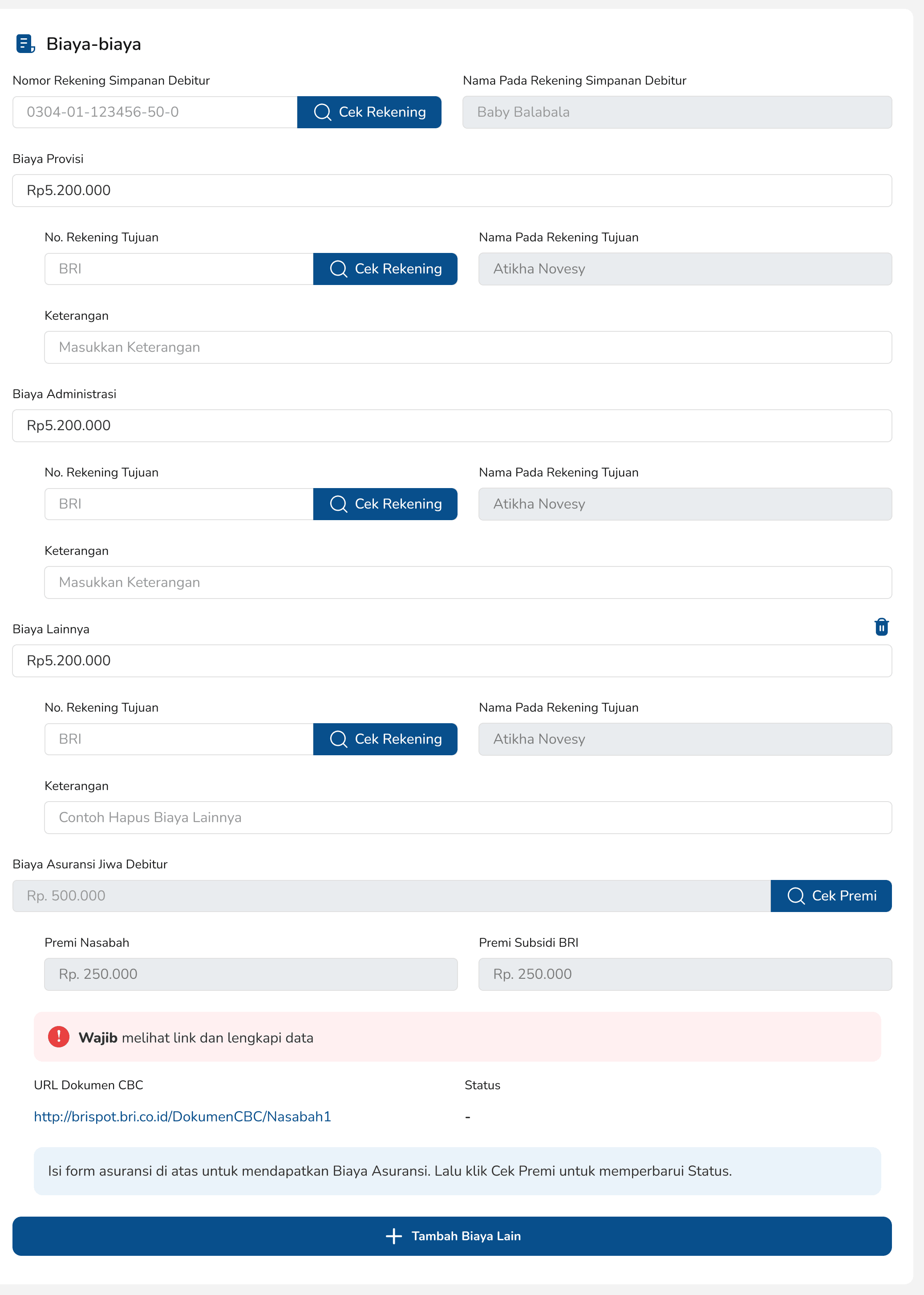
User interviews with internal staff surfaced the same complaint every time: the form took too long. Screens like Biaya-biaya, Analisa Agunan Tambahan, and Data Prescoring were packed with fields RMs re-entered every time. That set the real objective — cut the form down, not just restyle it.

Old BRISPOT Analisa Kredit flow — Non Finansial, Data Kredit, Data Prescoring, and Asuransi tabs on mobile, plus the Biaya-biaya screen on desktop, each packed with fields to fill in

The old Analisa Kredit flow — four tabs on mobile (Non Finansial, Data Kredit, Data Prescoring, Asuransi), plus the Biaya-biaya screen on desktop. This is what “too long to fill in” looked like, screen after screen.

// Process
01

A full redesign from day one, not a patch

The brief from day one: rebuild the old, cluttered BRISPOT interface into something seamless enough to speed up how Briguna applications moved. No scope pivot — the direction stayed the same from kickoff to ship.

02

Mapping judgment vs. administration

Mapped the full workflow across all three roles plus the two automated systems feeding into it (ARCI, Early Warning System) — separating hand-offs that were purely administrative from ones that needed a human decision. Every screen was designed around that split.

03

Shipping through a live infrastructure migration

This ran on infrastructure mid-migration — Checker & Signer were moving from legacy to React, access was moving onto SSO. Worked closely with engineering so design decisions never conflicted with what was actually shippable.

04

Grounded in real numbers from the people who'd know

Kept asking the product owner and business analysts one question: how many applications move through this every day? The answer — 1,000 to 3,000 per branch — kept the redesign honest. Not a workflow to redesign on instinct alone.

// The Solution

Redesigned the workflow so each role saw only what needed their judgment — cutting the re-reading-context tax at every hand-off. The same thinking extended into the Whitelist and cross-bank Open Flagging modules, turning a manual eligibility lookup into something the system surfaced automatically. The interface got a fresh, seamless skin over the same logic, replacing the old, cluttered UI staff had grown used to. The platform later extended into KPR Digital's notary workflow and an RBAC system for national quota allocation — platform context, not the focus here.

Before landing on role-based screens, I considered two other directions. One was a single long-form screen with progressive disclosure — collapsing sections instead of splitting by role — which worked fine for a single approver but broke down once Credit Admin Officers needed to jump between nine analysis areas without losing their place. The other was automating more of the judgment calls themselves, flagging applications as pre-approved based on the same data ARCI and the Early Warning System already produced. I pushed back on that one: automating a credit decision on a lending platform this size raises compliance questions well beyond a UI call, and it wasn't mine to make unilaterally. Splitting by role — administrative hand-offs separated from ones needing real judgment — was the version that survived contact with how credit ops actually worked.

The redesigned BRISPOT flows, top to bottom: RM (Relationship Manager submission), Putusan Kredit (credit decision), and Analisa Data Kredit (Credit Admin Officer's analysis, broken into nine focused tabs)

Top to bottom: RM — the submission flow, shortened to only what a Relationship Manager needs to enter. Putusan Kredit— the Approver's decision flow, surfacing what needs judgment instead of a wall of fields. Analisa Data Kredit— the Credit Admin Officer's full analysis, split into nine focused tabs instead of one long scroll.

// Outcome
~3 weeks → 3–5 daysapproval time, still what credit ops uses to process applications at national scale today
1,000–3,000Briguna applications processed per day, per branch — the real scale this workflow runs at

That number didn't come from a dashboard — it came from repeatedly asking the product owner and business analysts what actually moved through the system. At that scale, a seamless interface wasn't cosmetic; it was the difference between a workflow that scales and one that quietly slows everyone down. Approvers and Credit Admin Officers also said the workflow felt lighter — less time figuring out what needed attention, more time deciding.

// Reflection

On a platform this high-stakes, I default to what's already in the design system rather than improvising — UI stability matters more here than anywhere else. When thousands of applications move through it daily, consistency isn't a nice-to-have; it's what keeps people running it fast. If I were starting this over, I'd push earlier for direct time-in-queue instrumentation instead of relying on stakeholder estimates for the before number — 3 weeks held up, but I'd rather have measured it than asked for it.

More case studies.

See the rest of the portfolio — design systems, dashboards, and everything in between.

Back to Case Studies →